My Role

UX/UI Designer – Took a key role in the website redesign, shaping the design in collaboration with the team and client

Team

Collaborated with UX Designer & UX/UI Designer

Client

Agora Connections

Project Timeline

November – December 2024 (6 weeks)

Who is the Client?

Agora Connections is contracting and consulting firm specializing in ERP, web development, branding, and process automation for small to mid-sized businesses.

The Goal

Improve the site’s structure, branding, and user engagement to better showcase Agora Connections’ services and help potential clients understand their value more easily.

Competitive Analysis: Learning from Industry Leaders

Since the client did not provide clear guidelines, I started by analyzing three competitors—Twilio, Vonage, and iWeb—to identify best practices and common UX/UI patterns. This analysis helped define key areas for improvement and informed our design decisions.

  1. Twilio (https://www.twilio.com/)

Strength: Effective Use of Icons & Graphics

  • The graphics are clean and lightweight, avoiding unnecessary distractions.


  • The iconography and illustrations maintain a cohesive style, reinforcing Twilio’s brand identity.

  • The graphics are clean and lightweight, avoiding unnecessary distractions.


  • The iconography and illustrations maintain a cohesive style, reinforcing Twilio’s brand identity.

Weakness : Flat Visual Hierarchy

  • Fonts, sizes, and weights across different sections don’t create enough distinction, reducing readability.


  • Many sections have a uniform layout, which makes scanning less intuitive.

  • Fonts, sizes, and weights across different sections don’t create enough distinction, reducing readability.


  • Many sections have a uniform layout, which makes scanning less intuitive.

  1. Vonage (https://www.vonage.com/)

Strength: Comprehensive & Informative Content

  • Instead of just listing features, the page explains how they apply to real-world scenarios, making it easier for users to see the value.


  • Everything from key features to setup guides is included on the page, eliminating guesswork and helping them make informed decisions quickly.

  • Instead of just listing features, the page explains how they apply to real-world scenarios, making it easier for users to see the value.


  • Everything from key features to setup guides is included on the page, eliminating guesswork and helping them make informed decisions quickly.

Weakness : Too Much Going On

  • The tight content placement reduces clarity and increases cognitive load, making the page feel crowded and harder to scan.


  • The absence of alignment and structure makes the design feel disorganized.

  • The tight content placement reduces clarity and increases cognitive load, making the page feel crowded and harder to scan.


  • The absence of alignment and structure makes the design feel disorganized.

  1. iWeb (https://iweb-soft.com/)

Strength: Clean and Modern Look

  • It uses big images and icons to highlight key features.


  • The design feels welcoming and human, with photos and illustrations that help tell a story.

  • It uses big images and icons to highlight key features.


  • The design feels welcoming and human, with photos and illustrations that help tell a story.

Weakness : Overloaded Content Blocks

  • Long blocks of text without subheadings, bullet points, or spacing make it hard for users to skim key details.


  • Without visual cues (bold text, icons, or key takeaways), users might struggle to find important information quickly.

  • Long blocks of text without subheadings, bullet points, or spacing make it hard for users to skim key details.


  • Without visual cues (bold text, icons, or key takeaways), users might struggle to find important information quickly.

Understanding the Challenge: What Needed Improvement?

Beyond competitive analysis, I conducted usability testing with seven participants on the current website to identify key pain points.

  1. Navigation Issues

  • Multiple CTA buttons ('Contact Us' & 'CALL US NOW'), causing confusion


  • Lack of clarity in 'Contact Us' placement and functionality

  1. Lack of Information

  • Lack of detailed service breakdown


  • No clear pricing comparison


  • Unclear project timeline for different packages

  1. Visual Hierarchy Problems

  • Inconsistent spacing


  • Repetitive images cluttering the layout

  1. Weak Branding & Inconsistent Design

  • Generic visuals


  • Lack of strong brand identity

  1. Low Engagement & Conversion Issues

  • Users struggled to understand services


  • Leading to fewer inquiries

Design Exploration: Two Initial Concepts Suggested for the Client

After identifying these usability issues, I explored different design directions to improve clarity, engagement, and brand consistency. To do this, I created two homepage concepts, each with a unique approach.

Concept 1

Real Photo-Based Design

  • Used high-quality real images to create a more personal and trustworthy feel.


  • Focused on showcasing real people and work environments to enhance authenticity.


  • Aimed to create an emotional connection with users through visual storytelling.

  • Used high-quality real images to create a more personal and trustworthy feel.


  • Focused on showcasing real people and work environments to enhance authenticity.


  • Aimed to create an emotional connection with users through visual storytelling.

Client Feedback:


  • The client thought real photos made the design look less modern and unique.


  • It was hard to match the photos with their existing brand style.


  • The client wanted a more stylish look instead of a traditional business feel.

Client Feedback:


  • The client thought real photos made the design look less modern and unique.


  • It was hard to match the photos with their existing brand style.


  • The client wanted a more stylish look instead of a traditional business feel.

Client Feedback:


  • The client thought real photos made the design look less modern and unique.


  • It was hard to match the photos with their existing brand style.


  • The client wanted a more stylish look instead of a traditional business feel.

Client Feedback:


  • The client thought real photos made the design look less modern and unique.


  • It was hard to match the photos with their existing brand style.


  • The client wanted a more stylish look instead of a traditional business feel.

Concept 2

Graphic-Based Design ✓

  • Focused on using bold graphic illustrations to create a sleek, modern look.


  • Strengthened brand identity by using a consistent color palette and typography.


  • Improved visual hierarchy and readability, making information easier to scan.

  • Focused on using bold graphic illustrations to create a sleek, modern look.


  • Strengthened brand identity by using a consistent color palette and typography.


  • Improved visual hierarchy and readability, making information easier to scan.

  • Focused on using bold graphic illustrations to create a sleek, modern look.


  • Strengthened brand identity by using a consistent color palette and typography.


  • Improved visual hierarchy and readability, making information easier to scan.

Client Feedback:


  • The client liked this version because it looked cleaner and more professional.


  • Using graphics instead of photos made the design more unique and creative.


  • The Client asked to add more black to give it a sleek, modern feel.

Client Feedback:


  • The client liked this version because it looked cleaner and more professional.


  • Using graphics instead of photos made the design more unique and creative.


  • The Client asked to add more black to give it a sleek, modern feel.

Collaborative Design Process: Individual Concepts

After choosing a graphic-based approach, our team of three UX and UX/UI designers each created different design versions to explore various ideas. We focused on different aspects of the user experience while keeping the main goals of the redesign in mind.

My Design ✓

  • Used bold graphics and structured layouts to create a modern yet friendly look.


  • Added more black elements based on the client’s request for a sleek and professional feel.


  • Focused on clear navigation and strong visual hierarchy to improve usability.

  • Used bold graphics and structured layouts to create a modern yet friendly look.


  • Added more black elements based on the client’s request for a sleek and professional feel.


  • Focused on clear navigation and strong visual hierarchy to improve usability.

Client Feedback:


  • Preferred this version for its professional yet dynamic design.


  • Liked how the black accents made the brand stand out.


  • Found the layout and navigation easy to use, making information more accessible.

Designer 1

  • Created a light, clean design.


  • Used illustrations and minimal UI elements for a fresh and simple feel.


  • Focused on clear service sections to improve navigation.

  • Created a light, clean design.


  • Used illustrations and minimal UI elements for a fresh and simple feel.


  • Focused on clear service sections to improve navigation.

  • Created a light, clean design.


  • Used illustrations and minimal UI elements for a fresh and simple feel.


  • Focused on clear service sections to improve navigation.

  • Created a light, clean design.


  • Used illustrations and minimal UI elements for a fresh and simple feel.


  • Focused on clear service sections to improve navigation.

Client Feedback:


  • Liked the open, airy layout and friendly design.


  • Thought it was too minimalistic for their brand identity.


  • Wanted a stronger visual presence with more depth and contrast.

Designer 2

  • Used a dark theme with bold typography to create a strong, modern look.


  • Designed with structured layouts and high-contrast elements for better readability.


  • Included simple icons to enhance visual communication.

  • Used a dark theme with bold typography to create a strong, modern look.


  • Designed with structured layouts and high-contrast elements for better readability.


  • Included simple icons to enhance visual communication.

Client Feedback:


  • Appreciated the modern and professional style.


  • Wanted a better balance between text and graphics.


  • Asked for stronger brand identity elements.

Client Feedback:


  • Preferred this version for its professional yet dynamic design.


  • Liked how the black accents made the brand stand out.


  • Found the layout and navigation easy to use, making information more accessible.

Client Feedback:


  • Preferred this version for its professional yet dynamic design.


  • Liked how the black accents made the brand stand out.


  • Found the layout and navigation easy to use, making information more accessible.

Client Feedback:


  • Preferred this version for its professional yet dynamic design.


  • Liked how the black accents made the brand stand out.


  • Found the layout and navigation easy to use, making information more accessible.

Client Feedback:


  • Liked the open, airy layout and friendly design.


  • Thought it was too minimalistic for their brand identity.


  • Wanted a stronger visual presence with more depth and contrast.

Client Feedback:


  • Appreciated the modern and professional style.


  • Wanted a better balance between text and graphics.


  • Asked for stronger brand identity elements.

Client Feedback:


  • Appreciated the modern and professional style.


  • Wanted a better balance between text and graphics.


  • Asked for stronger brand identity elements.

Client Feedback:


  • Appreciated the modern and professional style.


  • Wanted a better balance between text and graphics.


  • Asked for stronger brand identity elements.

Second Iteration: Refining the Design Based on Client Feedback

After reviewing the initial design, the client requested more detailed packaging and pricing information, as well as a stronger black color presence for a sleeker look. Based on this feedback, I made the following refinements.

These refinements enhanced both the visual appeal and usability, ensuring the design met branding and functional goals.

Updated Style Guide: Incorporating Blue into Branding

The client asked me to add blue to their existing brand colors. I updated the style guide to make the design look more modern and visually consistent. This change helped strengthen their brand while keeping it fresh and dynamic.

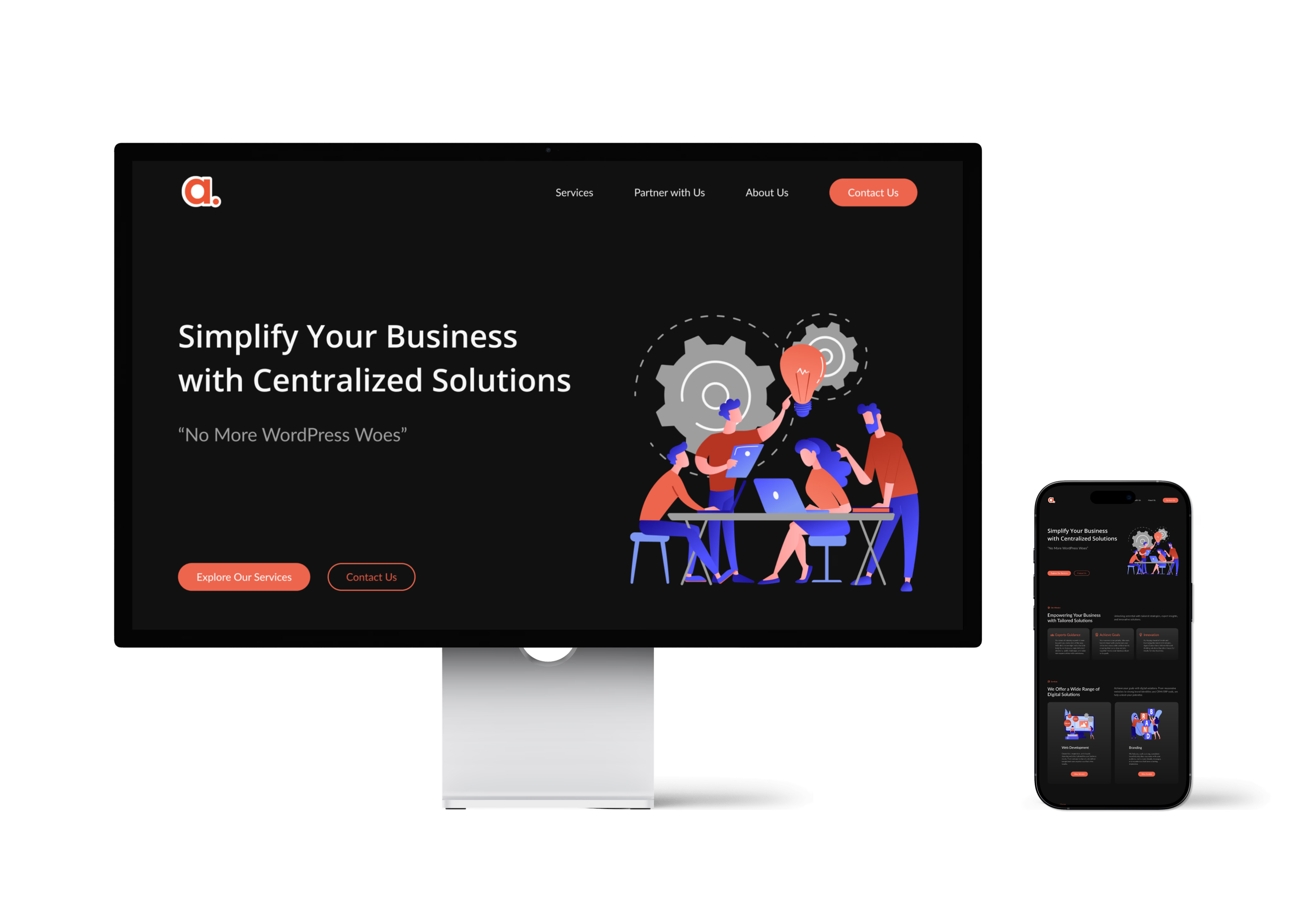
The Final Design: Approved & Ready

Following the final refinements, the client approved the design and requested its implementation on Squarespace. Our team handled the process of adapting the Figma design into a fully functional website.

Implementation Process

  1. Built the approved design on Squarespace, ensuring responsiveness and functionality across desktop and mobile.

  2. Adjusted layouts and elements to fit Squarespace’s constraints.

  3. Worked to match the original Figma design as closely as possible.

Challenges & Outcome

  1. Design differences → Some elements looked different due to Squarespace’s limitations.

  2. Unexpected layout shifts → Certain sections didn’t align perfectly with the original Figma design.

  3. Client decision → After reviewing the live site, the client decided to revert to the original version and worked with a developer to make further modifications.

Key Takeaways

💡 Design Flexibility → Learned that platforms like Squarespace have built-in limitations that can affect the final outcome.

💡 Client Communication → Keeping the client informed about possible design variations in implementation is essential.

💡 Problem-Solving → Even after approval, adaptability is key when working with third-party platforms.

I’m always happy to learn and explore new opportunities.

If you have any questions or just want to connect, feel free to reach out to hello@jiwonyae.com

 © 2025

Jiwon Yae

2:23:14 AM

NYC

I’m always happy to learn and explore new opportunities. If you have any questions or just want to connect, feel free to reach out to hello@jiwonyae.com

 © 2025

Jiwon Yae

2:23:14 AM

NYC

I’m always happy to learn and explore new opportunities.

If you have any questions or just want to connect, feel free to reach out to hello@jiwonyae.com

 © 2025

Jiwon Yae

2:23:14 AM

NYC

I’m always happy to learn and explore new opportunities.

If you have any questions or just want to connect, feel free to reach out to hello@jiwonyae.com

 © 2025

Jiwon Yae

2:23:14 AM

NYC